The maps we present here have been produced by modelling bird abundance from BBS data to obtain estimates of population density and change in population density across the whole country.
Because not every 1-km square in the country is surveyed, statistical modelling is needed to fill in the gaps between surveyed squares using information on their location and habitat (land cover). In practice, the model relates the number of birds counted in each BBS squares to the habitat in that square, and to its location, because squares that are close together and have similar habitat are more likely to have similar densities of birds than squares that are far apart. We also incorporate information from BBS surveyors on how far away birds were recorded in order to account for the detectability of each species in estimating the densities.
All models were run for two 3-year time frames: 1994-1996, which represents the start of the BBS period, and 2007-2009.
Interpreting the maps
For each species, the first map shows predicted density in the later years (2007-2009) across the country. This is the latest available density map at UK scale derived from BBS data. As shown in the legend, darker colours correspond to higher densities (expressed as the number of birds present per square kilometre). The resolution of this map is 1 km.
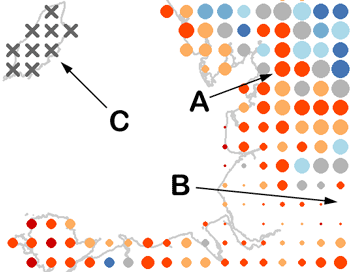
The second map shows information about changes in population density from 1994-1996 and 2007-2009 at a 10 km resolution. The map presents two different pieces of information using combinations of dot colour and size. Colour shows the relative change in population densities with blue colours showing increase and red colours showing decline. Grey colours indicate no change. The relative change is simply the proportional change in density between the two time frames. Dot size indicates the mean abundance of that species across both time-periods, so that locations with large dots were estimated to contain more birds than those with few dots.
curlew-map-detail.gif

A detail of the Curlew map is shown here as an example. The dark-orange dot indicated by ‘A’, for instance, shows a relative decline of between 50% and 75% of the 1994-1996 population density. See the full Curlew map for the complete legend. The dot is rather large and its size means that, as an average between the two periods, the area supported an estimated density of 1-2 birds km-2, which means 100-200 Curlews, or 50 – 100 breeding pairs, in the 10 km x 10 km square. The density map indicates the latest density estimates at a higher resolution. The same logic applies to the blue dots, which represent increases, whilst the grey dots mean that the density of birds did not vary substantially, with estimated changes less than 25% increases or decreases. If the modelled density in the square is very low, we do not show any dot (see arrow ‘B’ for example). On the Isle of Man there are grey crosses (see arrow ‘C’), indicating that we do not have enough data to estimate Curlew trends with reasonable reliability in this location. More BBS squares would be necessary to estimate trends in areas with grey crosses.
This work was mainly carried out by Dario Massimino of the BTO's Population Ecology and Modelling Team, working with Alison Johnston, James Pearce-Higgins and Stephen Baillie.