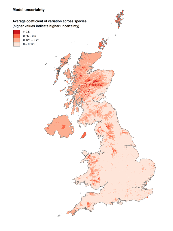
Modelling always involves some degree of approximation; therefore the figures that you see on the maps are not always exactly what you can find in reality. The accuracy of a species distribution model depends on many factors, for example the density of survey squares in the region or the extent to which the density of a certain species is influenced by factors not accounted for in the model. These maps are likely to be more accurate where there is a high concentration of BBS squares, whilst in areas with fewer survey squares, the model estimates the species density based on the nearest available data and the relationship between the species and similar habitats in better sampled areas. Particularly critical areas are the islands, which do not have neighbouring areas for interpolation and often have only a small number of sample squares. For this reason many of the islands have grey crosses, because the uncertainty in these areas is often high.
The map to the right shows the average coefficient of variation (a measure of the uncertainty associated with each estimate) of the density estimates across all species. The darker the colour, the higher is the uncertainty. Uncertainty appears particularly high for islands, in Northern Ireland (where the BBS coverage in 1994 and 1995 was low) and in upland areas (particularly in the Scottish Highlands). Because of the small number of BBS squares on some of the Scottish Islands and the Isle of Man, there are a number of species we know breed on these islands which our maps fail to detect. Hopefully as BBS coverage increases, particularly in these areas, these false gaps in occurrence should be minimised. On the other hand density estimates appear relatively reliable for much of lowland England, Wales and southern Scotland.
Model performance not only varies across different geographical areas, but also across different species. An overall indication of how well a model has fitted the data for a single species is given by the proportion of explained deviance, which compares the amount of variation in density which is not explained by the statistical model with the original variation in the data. The higher this number, the better the model has fitted the data. A
(CSV / excel).
The maps for the species with low explained deviance (Kestrel and Cuckoo for example) should be interpreted more cautiously because there is still a lot of variation in the data that has not been accounted for by the model.
Statistical modelling also involves a simplification of the extremely complex network of relationships between variables. The ‘best’ level of simplification is a compromise among different necessities and depends on many aspects, including the purpose of the model and the amount of available data. Overly complicated models, for example, are likely to artificially overfit the data or not to fit them at all within a reasonable time. In our case, it was not possible to include in the model all the possible interactions between habitat and space and, as a consequence, the statistical relationship between a species and a habitat is assumed to be constant across the whole country for a certain time frame.
The data used to draw these maps come from the same database as the data used to calculate the BBS trends in the annual BBS report. However, the spatial and temporal scales are different. In the BBS report data from all years are simultaneously analysed and a smoothed function is fitted to the data. As a result of smoothing, the estimated population trends between, for example, 1995 and 2009 are not excessively influenced by unusual highs or lows that could have happened in the two end years. To produce our maps we could not use a smoothing function over time because the model would have become too complex, considering that there is already a three-dimensional spatial smooth in the model and seven habitat variables. We then opted for a three-year average of the population density, which still rounds off most of peaks but in some cases may produce results that do not fully match those from the BBS trend analysis. For example, our maps for Kestrel and Lapwing appear to show more positive trends than the overall BBS trend analysis because of particularly high counts in 2008 for these species.
When accounting for detectability to generate density estimates, we cannot use the data of birds seen in flight or in the furthest distance band. For some species, such as Swift, House Martin, Starling, Buzzard and Kestrel, the proportion of birds seen in flight is very high (up to 86% for Swift). Estimates for these species are therefore likely to be more uncertain.
