New BirdTrack visualisations
18 May 2016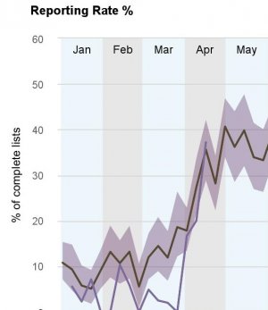
We recently added new visualisations to BirdTrack's global data entry portal. There are two options for you to choose from for visualising the data submitted to BirdTrack. The first is peak count, a graphing tool which displays the highest counts recorded for a particular species in a given week.
The second visualisation option is reporting rate (which is the global equivalent of the visualisation on the UK and Ireland BirdTrack front page). There are several additional features in the new reporting rate graphs, including confidence intervals. These appear as a band around the historical reporting rate line, and show where the historical average will fall 95% of the time.
By choosing the various different options from Region, Species and Series you can create your own unique graphs. Using the add plot button, you can even overlay different species and years, as well as countries. Once you have created a graph, you can download it in a variety of formats via the 'hamburger' (three stacked horizontal bars) at the top of the graph.









Share this page